How to Create a Group Bar Chart
Warning: In this example we assume that you have already connected your Notion account with Data Jumbo and we can read your databases.
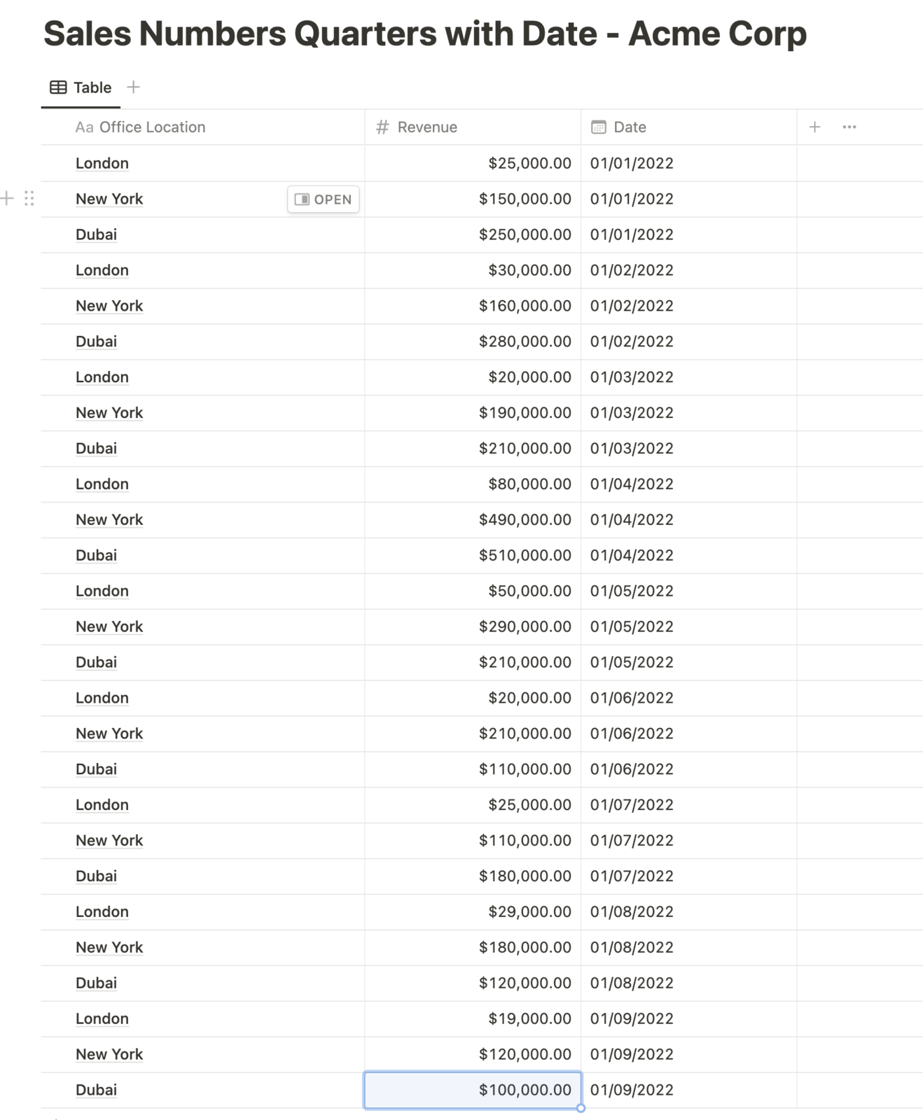
For the example, we have a fictitious company "Acme Corp" that generates sales of women's fashion in London, New York and Dubai. As the managing director, we enter the sales of each city into our Notion database every month. The database looks like this:
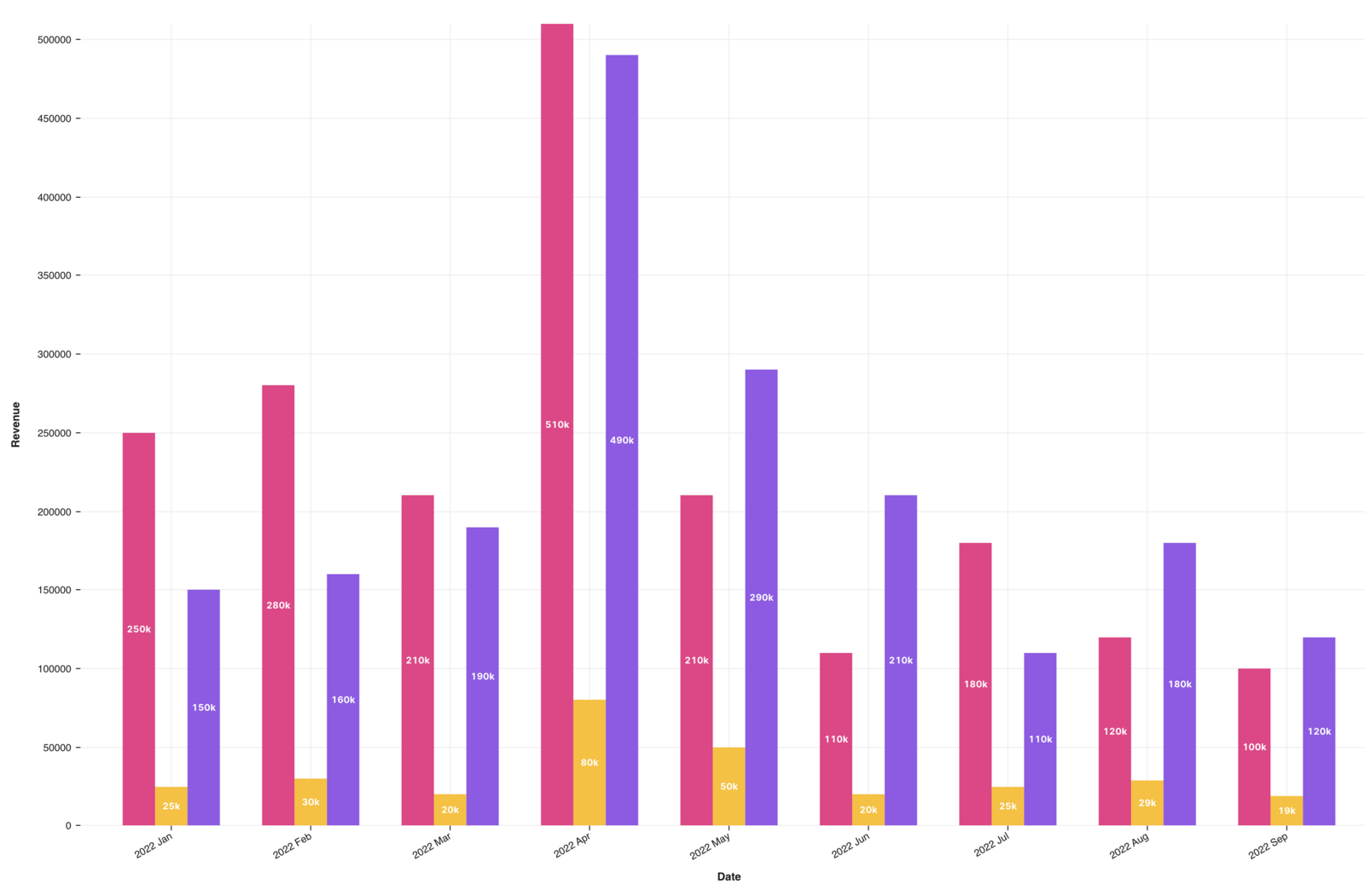
Now we want to create a bar chart in which we can see the comparison per month of each city.
1. Create bar chart with revenue database
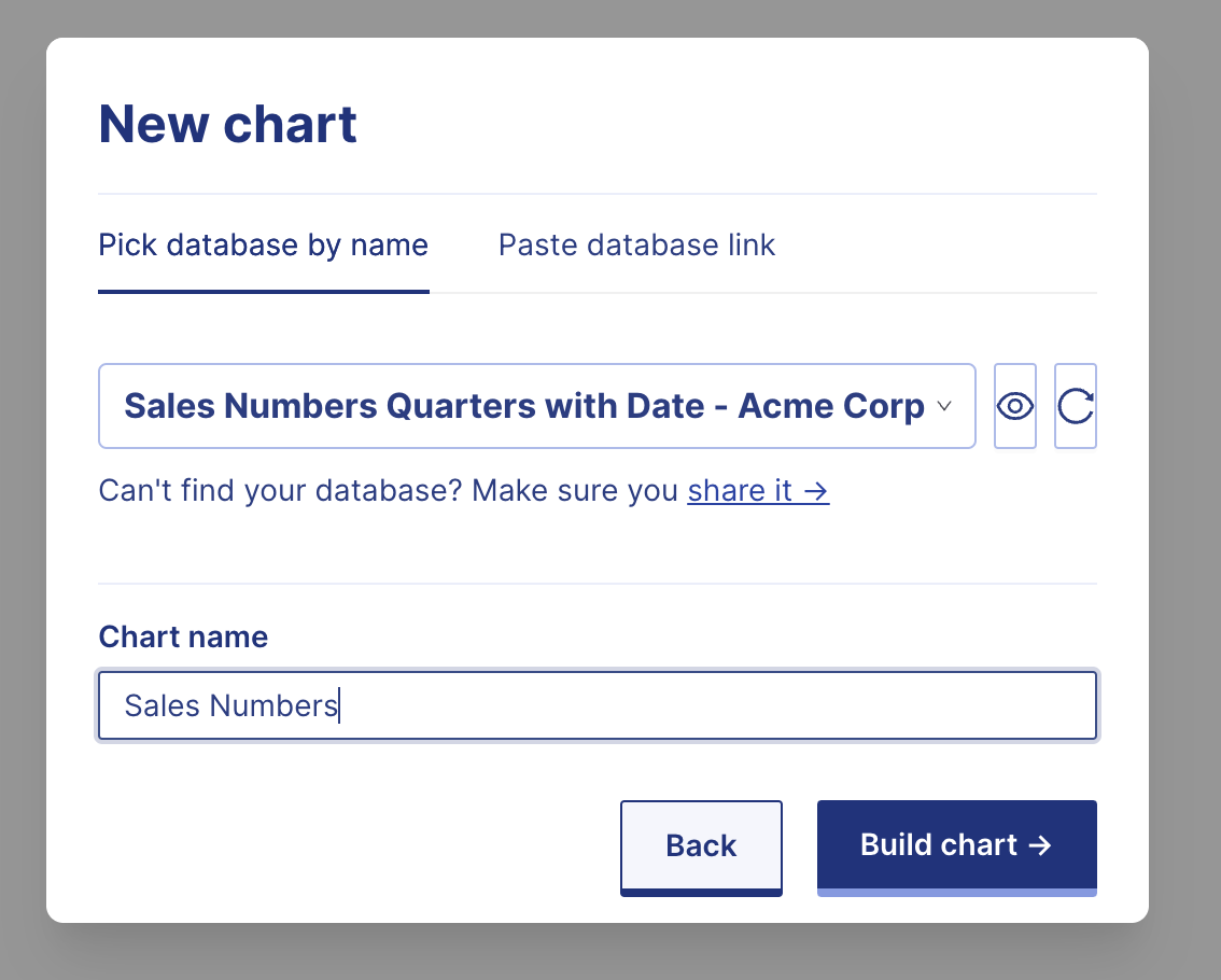
- Create a new chart by click on button "Create a new chart"
- Dialog opens select your revenue database, in our case "Sales Numbers Quarters with Date - Acme Corp"
- Change name of the chart and click on "build chart"
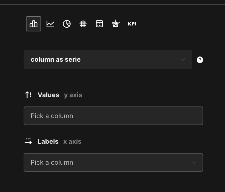
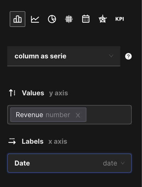
2. Select bar chart and value and labels
After clicking on the "build chart" button, we are given the option to select chart type and decide which data to display in the chart. For value and label we have to select the corresponding column.
Warning: Now we need to select the right columns so that we can group the right data later.
This is how the data must be selected:
This is how the chart looks after the right selection:
3. Refine date bucket
In order to group the data by months, we need to give Data Jumbo this additional information. This can be done by setting "Bucket by date". We need to change the selection from Direct value to Time Interval. With this change we can now choose between the following time intervals: day, week, month and year. Now we only have to set the function "Sum Revenue".
Warning: The time interval by quarter will be published shortly.
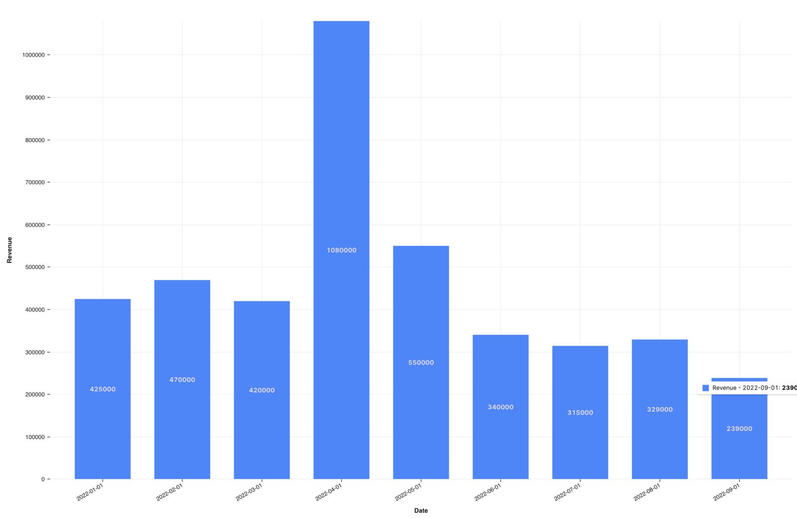
Displays revenue per month:
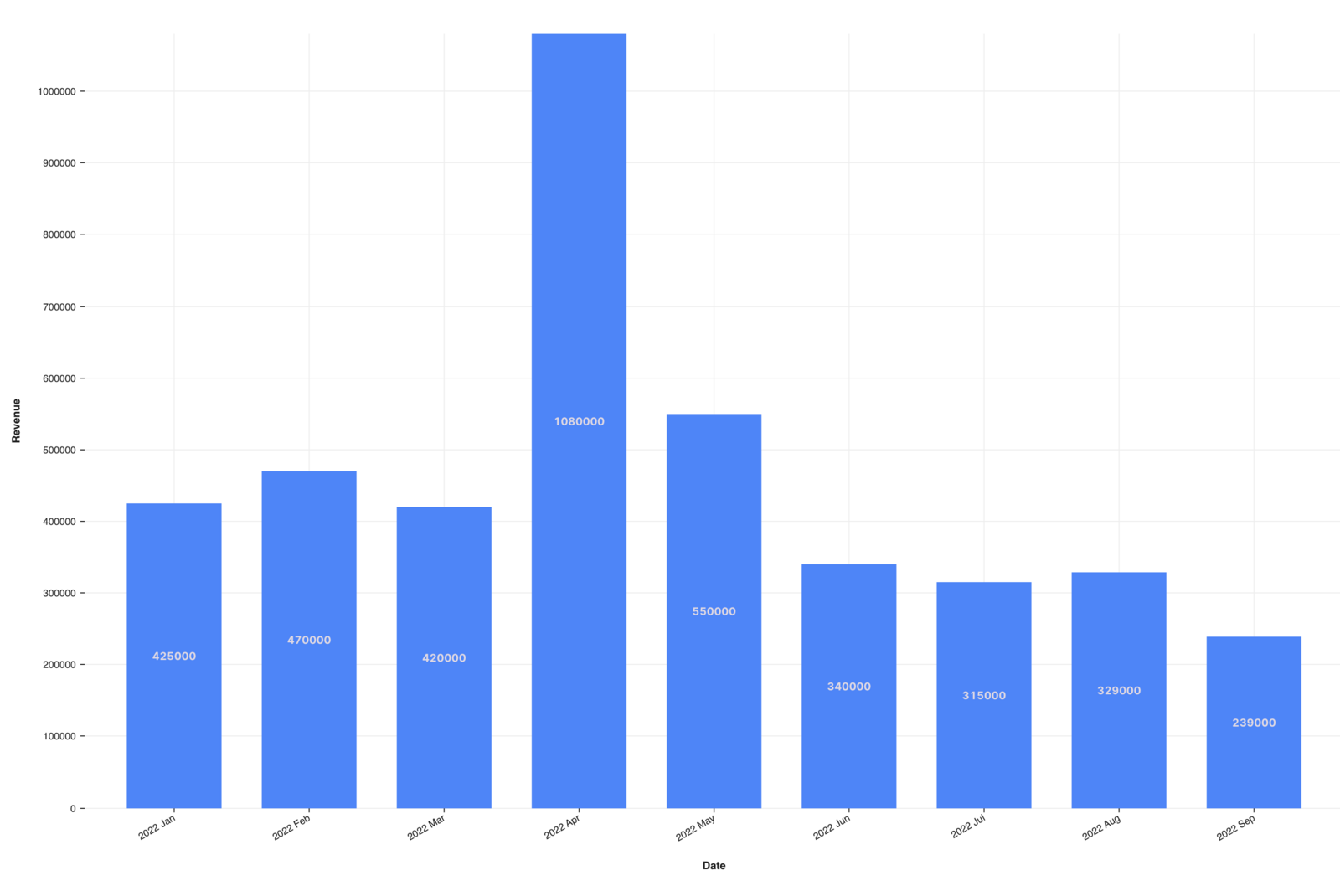
4. Group data by date per month
Now we can move on to the most important section where we now split the data by office location to allow grouping.
- Check split on left hand to activate splitting
- Pick the column office location
Office locations are stacked:
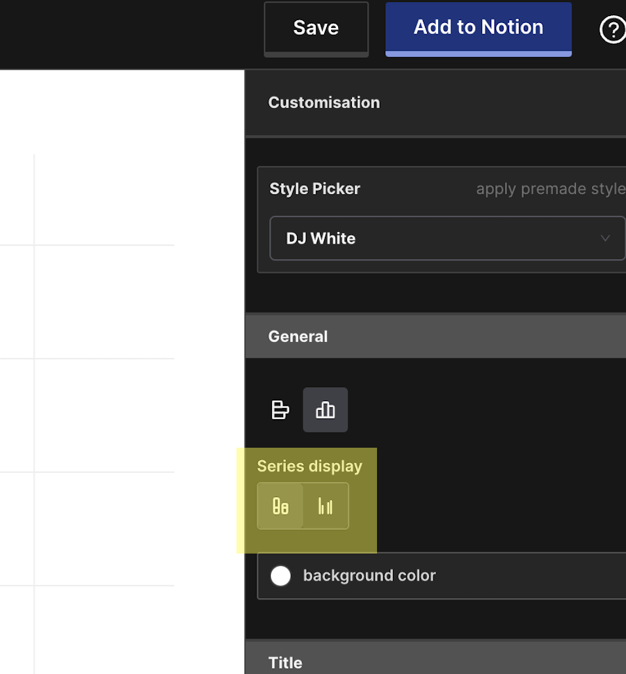
Now we only have to change from stacked to group on the right side. We do this by choosing the correct selection.
Series display - switch to grouped:
After these settings we now have our desired chart.
Final group chart: